How to Make Your Instagram Aesthetic: A Cohesive Feed That Gets Followers
To make your Instagram aesthetic, build a repeatable visual system and use it on every post: a small color palette, one consistent editing preset, one or two fonts, and a posting rhythm that keeps your grid looking planned. An aesthetic is not one filter or one lucky photo. It is the set of choices a visitor notices in the first few seconds on your profile, and it is what convinces them to follow instead of moving on.
What an Instagram aesthetic actually is
An aesthetic is a visual promise. It tells a visitor that your account has a point of view and that future posts will feel familiar. The strongest feeds share a few signals: similar colors, similar light, similar spacing, and similar type. None of those signals needs to be dramatic. Quiet consistency beats loud variety almost every time.
A single great photo can earn a like. A consistent grid earns a follow, because a follow is a bet on what comes next. Your job is to make that bet feel safe. When someone opens your profile, they should be able to picture your next five posts without reading a single caption.
Lock in your four visual variables
Every aesthetic you admire rests on four decisions made once and repeated often. Write them down before you create anything new.
1. A color palette of three to four colors
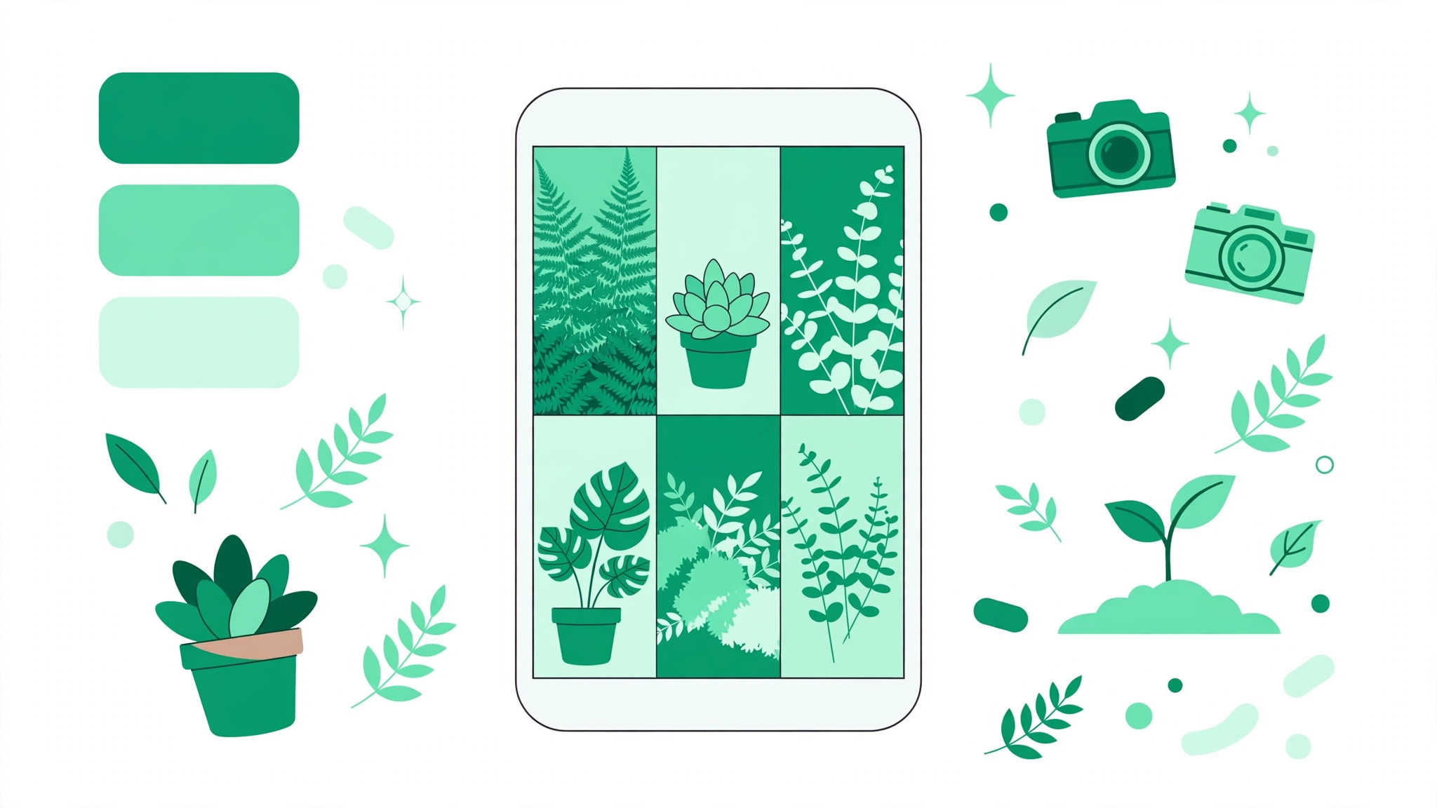
Pick three to four colors that show up again and again: one dominant color, one or two supporting colors, and one accent for text or highlights. Let the palette guide your backgrounds, props, and graphics. You do not need every color in every post. You need the same family of colors to keep appearing.
2. One editing preset
Choose one editing approach and stick with it: the same direction for brightness, contrast, and saturation on every photo. A preset does not mean every image looks identical. It means your bright photos and your moody photos still feel like they came from the same person. Save your settings in your editing app so you can apply them in one tap.
3. One or two fonts
Pick one font for headings and one for body text at most, and use them across your graphics, carousels, and story templates. Mixing five fonts across five posts breaks the feeling of a single account, even when the photos match. Test your fonts at small sizes first, since most people view your grid on a phone.
4. A content-type rhythm
Your rhythm is the pattern of post types across your grid. Some accounts alternate photo and graphic. Others use a row pattern, where every third post is a quote, a tip, or a behind-the-scenes shot. Others build around anchor posts, strong on-brand images placed at regular intervals to hold the grid together. Any pattern works if it repeats.
Plan the 9-grid before you post
Never judge a post alone. Judge it against the eight or eleven posts around it. Before publishing, look at your latest nine to twelve posts together and ask one question: does the new post belong here, or does it fight the grid?
This check catches the most common aesthetic mistake, which is posting a strong photo that clashes with everything around it. A photo can be excellent on its own and still be wrong for your grid. If it breaks your palette, your light, or your rhythm, save it for later or re-edit it to fit.
Make your profile match the grid
Your grid does not start at your first photo. It starts at your profile picture, your name, and your bio, and all three should speak in the same voice as your posts. A polished grid paired with a vague bio feels unfinished.
Your profile picture should be readable at a tiny size, with one clear subject and colors from your palette. Your bio should state the promise of the account in one or two lines: who it is for and what they will get. If writing that feels hard, try an Instagram bio generator to test different versions, then pick the one that sounds most like your grid looks. The same rule applies to your highlights: covers in your palette colors extend the aesthetic above the grid instead of interrupting it.
Design for rectangles, not squares
Since January 2025, profile grid tiles display as 3:4 rectangles rather than squares. Photos cropped for a square grid may now show more of the image than you planned, and graphics designed as perfect squares can look awkward in the taller frame. Design and crop for the rectangle, and check each post in the grid view before you publish.
There is also good news for perfectionists. Since June 2026, Instagram lets you reorder the grid natively, so a post published out of sequence no longer ruins your layout forever. Use this power lightly, though. Reordering fixes a layout, but it cannot fix a grid that has no system behind it.
Reels and carousels sit in the same grid, and their first frame is what visitors actually see there. Treat that first frame as a cover: it should match your palette, carry your font if it carries text, and look like it belongs next to your photos. A Reel with a random mid-video freeze frame breaks the grid even when the video itself is great.
Give every post a job
A cohesive feed is not a repetitive feed. The shared signals keep things consistent, while different jobs keep things interesting. Most strong accounts rotate three kinds of posts.
- Discovery posts reach new people: relatable tips and broad topics that travel beyond your current audience.
- Trust posts prove you know your subject: detailed guides, honest lessons, and clear explanations.
- Personality posts show the human behind the account: routines, opinions, and behind-the-scenes moments.
Check that all three jobs appear across your latest posts. A grid of only discovery posts feels shallow. A grid of only trust posts feels like a textbook. A grid of only personality posts gives a stranger no reason to stay. The mix turns a pretty profile into an account people follow and keep following.
Captions and hashtags support the same system. Keep your caption voice steady, and use hashtags that match each post topic rather than copying one giant block everywhere. An Instagram hashtag generator can help you find relevant tags for each post type. Pick your four variables, plan your next nine posts around them, and let the grid rebuild itself one row at a time. For free tools that support that growth, visit bigfollowers.in. A clear aesthetic brings visitors in. Useful content, posted on a steady rhythm, is what turns them into followers who stay.