Instagram Reels Cover Design Tips That Get Clicks
Short answer: a good Instagram Reels cover uses one focal point, 3 to 5 words of bold text, brand colors and fonts, and high contrast, with all key elements kept in the center of a 1080 by 1920 pixel canvas so they survive the profile grid crop. Your cover is the still image people see before they press play, and on your profile grid it is the only thing standing between a visitor and a tap. These Instagram Reels cover design tips will help your covers get clicks and make your grid look intentional.
What an Instagram Reels Cover Does
An Instagram Reels cover is the still image people see before they press play: on your profile grid, in the Reels tab, and as the preview when someone shares the Reel. A visitor scanning your profile should tell what each Reel is about in about a second.
The first frame plays the moment your Reel appears in a feed, usually with the sound off, and has to stop the scroll. The cover is read on a small tile next to your other covers, so consistency matters more than surprise. Instagram Help currently says you cannot edit the cover after you have uploaded the Reel, so choose the cover at share time and check it before you post. Pair strong covers with our guide on how to get more views on Instagram Reels.
Instagram Reels Cover Size and Safe Zones
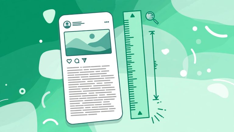
The correct Instagram Reels cover size is 1080 by 1920 pixels at a 9:16 aspect ratio, the same as the video itself. But how Instagram crops that canvas matters most. On your main profile grid, Instagram shows a 4:5 center crop, roughly 1080 by 1350 pixels, while the Reels tab and player show the full 9:16 frame. A cover that looks perfect full screen can lose its top and bottom on the grid.
Design for the grid first. Keep all important content in the central area, roughly between Y 285 and Y 1635. Never place text or key visuals in the top or bottom 285 pixels, because those areas get cropped or covered by interface buttons.
5 Instagram Reels Cover Design Rules for Every Cover
These five rules apply to every cover, whatever grid system you pick.
1. One focal point
Pick one thing the eye lands on: a face, a product, or a short title. When a cover has a product, a person, a logo, and a headline fighting for attention, it turns into visual noise at tile size.
2. At most 3 to 5 words
A cover title is a label, not a caption. Short phrases like “Spring restock” or “3 ways to style it” read on a tile, while a full sentence does not. Put the detail in the Reel and the post copy, and use the Instagram caption generator on bigfollowers.in to write a caption that carries the rest of the message.
3. Brand type and palette, every time
Use the same one or two typefaces and the same two or three colors on every cover. Do not pull a new trending font for each post. A consistent palette is what makes a grid look planned instead of random.
4. High contrast at thumbnail size
Dark text on a light background, or light text on a dark one. Thin type over a busy photo disappears on a tile. If the image fights the text, add a solid band or a soft shadow behind the title rather than another sticker.
5. Keep key text centered
Meta does not publish an official profile grid crop ratio for Reel covers, and you will see 3:4, 4:5, and 1:1 quoted as if they were official, but none of them come from Meta. The practical guidance is simple: keep the title, the face, and the product in the middle of the frame, so they survive whatever crop the grid applies.
4 Grid Systems for a Consistent Profile Grid
Rules make one cover readable. A grid system makes twenty covers look like they belong together. Pick one system per content series and stick with it.
Color-blocked series
Give each content pillar its own background color from your palette. Tips might sit on cream, product drops on your accent color, and behind-the-scenes clips on charcoal. Over a few weeks, the grid reads as a pattern.
Recurring title band
Place a solid band in the same position and style on every cover in the series, with the title inside it. The image behind can change freely, because the band ties it together.
Consistent face or product framing
If a person or a hero product is the star of your Reels, frame them the same way every time: same distance, same eye line, same side of the frame, similar light. This system suits founder-led brands and single-product shops.
Numbered series
Put a large number on each cover, like 01, 02, and 03, with a short title underneath. Numbers tell visitors there is a set, which gives them a reason to watch the rest.
Video Frame vs Designed Still: Which Cover Should You Use
You have two ways to make a cover: pull a frame from the Reel, or design a separate still image. In the app you can scroll through your video to pick a frame, or tap Add from camera roll to upload a graphic. Pull a frame when the Reel has a clean, sharp moment with your subject in the center. Design a still when every frame is blurry or busy, or when your system needs a title band, a color block, or a number. Free tools on bigfollowers.in can help with captions and hashtags.
Instagram Reels Cover Design: Frequently Asked Questions
What size should an Instagram Reels cover be?
Use a 1080 by 1920 pixel canvas at a 9:16 aspect ratio. Keep all important text and visuals in the center, roughly between Y 285 and Y 1635, because the grid shows a 4:5 center crop.
Can I change a Reels cover after posting?
Instagram Help says you cannot edit the cover after upload, so choose it carefully at share time.
Should I use a video frame or a designed image as my cover?
Pull a frame when the video has a clean, sharp moment with your subject centered. Design a still when your grid system needs a title band, color block, or number, or when every frame is blurry or busy.
How many words should a Reels cover have?
Keep it to 3 to 5 words at most, with 3 to 4 words as the sweet spot. The cover title is a micro-headline that gives viewers a reason to tap.